One of the top news stories today on Bloomberg was “US Existing-Home Sales Fall to Seven-Month Low on Rates, Supply“. This along with hawkish statements from the Fed seemed to come as a market shock, but in reality the mortgage and housing story has been building for many months. As we have all witnessed, interest rates have been on a tear alongside inflation since about the beginning of 2022. The Fed has been increasing the front end of the curve in an effort to dampen inflation, but longer-term rates have followed (or led) which has put a crimp on all borrowers. This has impacted the US Mortgage market more than others with the 30 year fixed rate mortgage moving from its mind numbingly low pre-2022 levels of ~3% to its current nosebleed levels of ~8%:
With this screaming rally in mortgage rates, one would think that it would have a negative impact on housing prices because debt becomes more expensive, but that has not been the case at all! In fact, house prices across America have gone up about 40% since 2022:
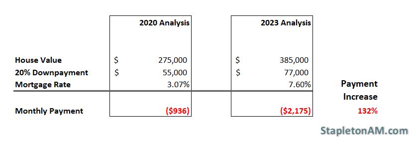
This leads us to the final question, how has this impacted the average buyer of a new house? If we take a rough example and assume a 2020 average house price of $275,000 (which is approximately true) and compare it to the new reality of a 40% increase in prices leaving that buyer with a $385,000 purchase for the same house, the math is painful. Not only was the buyer hurt by the higher purchase price, but also by a dramatically higher required downpayment and mortgage rate:
The buyer is faced with a $110,000 higher purchase price, a $22,000 higher downpayment, and a $1,239 or 132% higher monthly mortgage payment! It is a wonder that the housing market has held up as well as it has.
Portfolio diversification is at the heart of modern portfolio theory. Nobel Price laureate Harry Markowitz said, “Diversification is the only free lunch”. There are two primary ways to achieve investment diversification in a portfolio. The first is to pick more than one stock or bond. The old rule of thumb is that if you buy about 30 individual stocks you can create a “diversified” equity investment portfolio by reducing the amount of idiosyncratic risks (individual company risks) and leaving you with systemic risks (general broad market risks). Charlie Munger from Berkshire Hathaway would argue that stock diversification leaves you with mediocre returns, but we will leave stock picking as another topic for discussion.
The second way to diversify your portfolio is to diversify among asset classes. In the broader context, the main asset classes are public equities, private equities, fixed income and real assets. The onion can be continuously pealed with more narrow “asset classes” such as breaking apart public equities into sectors such as cyclical, non-cyclical, technology, utilities etc. Likewise, you could break apart fixed income into treasuries, investment grade corporate bonds, securitized fixed income, high yield bonds, etc. The definitions of specific asset classes are arguable, but the theme is consistent. For this discussion, we will only focus on equity and fixed income as they are the dominant asset classes in any portfolio construct and will contribute the most impact to any return and risk outcome for a portfolio.
For this analysis we will focus on two of the most followed indices in the financial markets – the S&P 500 Total Return Index (S&P 500) and the Bloomberg Barclays Aggregate US Fixed Income Total Return Index (US Aggregate Bond).
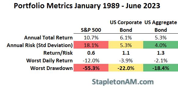
If we look at the long term geometric annual return of the S&P 500 on a total return basis it is quite impressive at 10.7% from the beginning of 1989 through June 2023. This phenomenal return is accompanied by its risk with annual volatility of returns being 18.1%. This metric implies (given a normal distribution of returns which is never true) that about 67% of the time the annual return will be +/- 18% of the annual average return. This is a good metric for describing stock return “noise”, but a more deeply painful metric is what investors experience from peak price to trough price in a large equity market sell-off. For the S&P 500 during this ~25 year period we experienced that with the Great Financial Crisis between 2007 and 2009. During that period, the S&P 500 sold off by more than 55%:
Equities experienced strong returns between 1989 and 2023 with large risk events
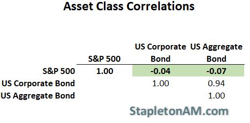
This period was also a strong return period for fixed income as interest rates predominantly dropped during the period. The annual return was not nearly as strong for the Bloomberg Barclays aggregate at 5.3%, but the risk was much smaller with only 4% volatility and a drawdown of -18.4%. It is not only the reduction in risk or volatility that makes fixed income such a great diversifier for equities, but also because its returns generally move in opposite or uncorrelated ways with the equity markets. If you look at the same period and measure the correlation of daily returns, you can see that the Bloomberg Barclays Aggregate has a -.07 correlation with the S&P 500:
Bonds are a great diversifier for equities
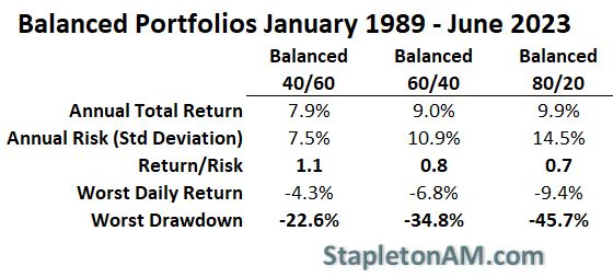
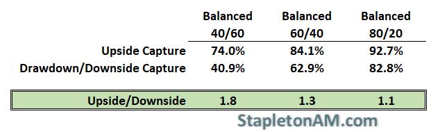
With this as a backdrop it makes perfect sense to look at mixed allocations of equities with fixed income. Many financial advisors use a moderate allocation for most clients which targets a 60% allocation to equities and 40% allocation to fixed income. As you can see below, this has produced a strong annual return of 9% with a volatility or risk metric of 10.9%. In context, the 60/40 balanced portfolio has captured 84% of the S&P 500’s return while maintaining only about 60% of the risk as measured by volatility or standard deviation:
Balanced Portfolios have experienced a strong capture of upside returns while strongly reducing downside risk
Lastly, it is important to acknowledge that annualized volatility is not the only risk metric that investors should look at. In reality, the most emotional pain is caused by how much your portfolio value is reduced from its peak valuation to its minimum valuation during a strong risk asset sell-off or correction. This is calculated by using the drawdown metric instead of annualized volatility and as you can see, the outperformance on a upside/downside basis stills holds true for balanced portfolios:
Equities display strong returns with large risk and drawdown events
The end result is that investors should carefully assess how much risk they are willing to take and adjust the portfolio accordingly. It is great to shoot for strong returns by increasing equity allocations, but we all need to be cognizant of the extra downside risk that is being introduced to the portfolio. When bonds were yielding ~2% per year, many investors moved to equities to increase projected returns. Now that many low risk fixed income investments can yield north of 5%, it is a great time to reassess the risk that is being taken in the investment portfolio.
With the recent Joe Rogan interview with Oliver Stone regarding his new documentary “Nuclear Now“, it is worth taking a look at energy production in the United States.
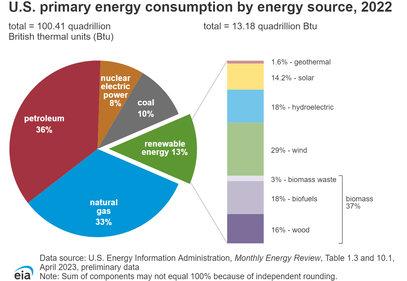
In aggregate, natural gas and petroleum are the largest sources of energy in the United States, but Coal, Nuclear and Renewable make up about 30% of total energy production:
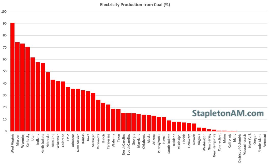
Energy production from Coal in the United States is still about 10% in total production, but with some egregious outliers by specific states:
Total energy production from Nuclear power plants is about 8%, but also has huge variation by state:
Lastly, energy production from renewables (Biomass, Hydropower, Geothermal, Wind & Solar) has been increasing rapidly in certain states and made up about 13% of total energy consumption:
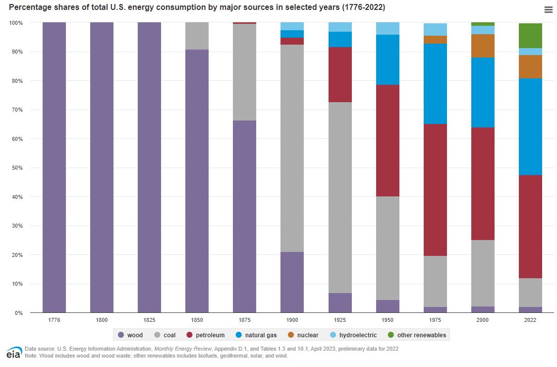
In aggregate, the United States is headed in the right direction but it is still a hot topic with climate change and pollution. In 1900 coal made up 71.4% of US production so we can say that progress has been made.
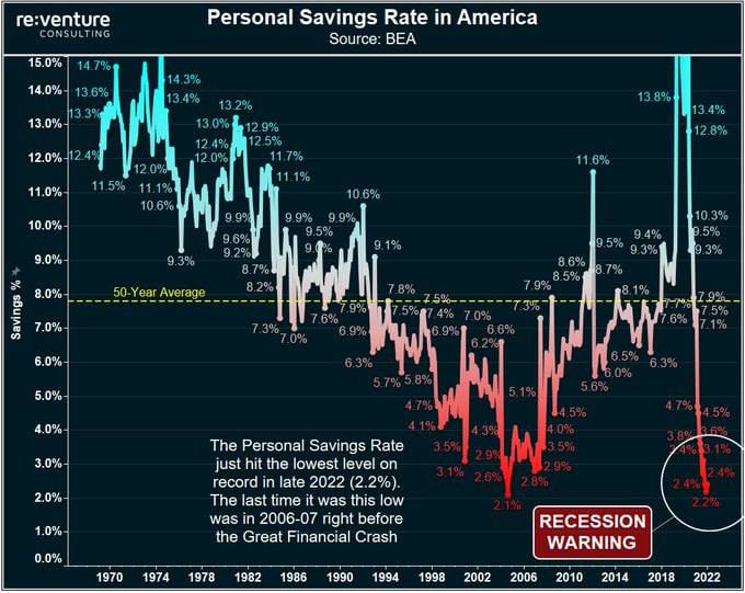
The graph speaks for itself. All of the savings accrued due to fiscal stimulus after COVID is being eaten away by higher prices and slower growing wages. We can speak about the job market being strong, but you cannot ignore the fact that the majority of Americans are living paycheck to paycheck to credit card…
To say that I have been on a hiatus is an understatement, but that does not mean that the events of the past year have been lost on me.
The truth is that quantitative easing has not and will not work. In fact, I believe that it will cause more pain than the sum of the total past benefits. Given the situation that we found ourselves in during the Great Financial Crisis, it is fair to say that quantitative easing and the actions of central banks made the immediate blow softer than it would have been. Unfortunately, the actions have also borrowed from the future and created instabilities that cannot last.
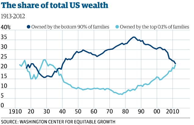
Did you know that the top .1% own as much as the bottom 90%:
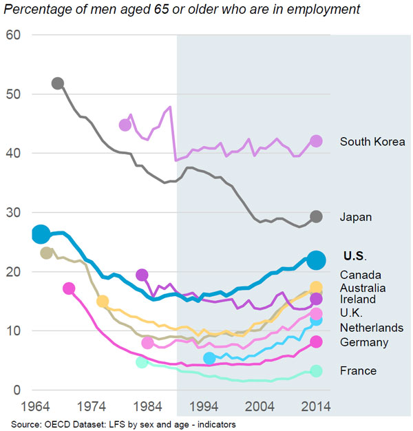
Did you know that workers are not retiring because they can’t afford it:
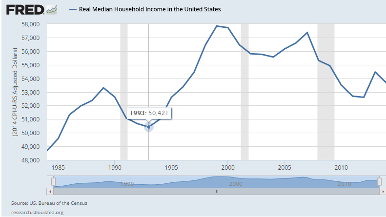
Did you know that median income levels are below those set back in 1997:
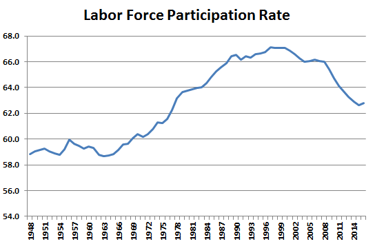
Did you know that the labor force participation rate is as low as it was in 1977 when less than 40% of eligible women worked:
The reality is that the US economy is sick, yet financial markets show extremely optimistic valuations with interest rates the lowest in 5,000 years:
and corporate bonds at peak valuations:
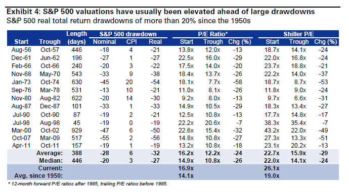
At this point we should probably mention that equity valuations are above the levels that were achieved before historic drawdowns:
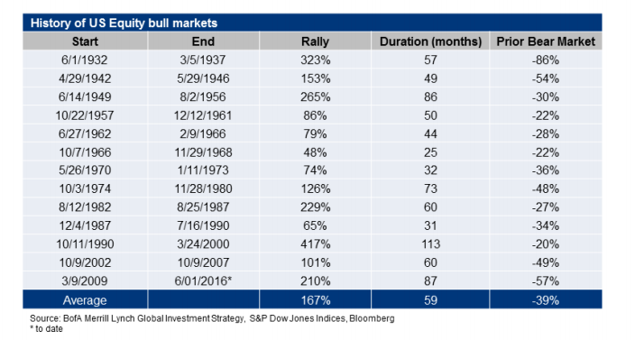
And that this bull market is 28 months older than the average bull market:
I am not sure when this grand experiment will end, but I am confident that there will be blood in the streets.
Trading can be stressful, but playing a rigged game is worse. SurlyTrader will explore the hidden game of financial institutions and the government that supports them while providing useful tips on trading strategies, hedging and personal finance. About SurlyTrader: SurlyTrader is a portfolio manager at a large financial institution who specializes in trading derivatives. He […]more →
SurlyTrader's Book!
Buy the print book in color and get the Kindle version for free along with all examples in a spreadsheet tutorial!