Skip to content


How to Spot & Time Stock Market Tops

Guest Post – Chris Vermeulen from TheGoldAndOilGuy.com


Since the middle of April everyone and including their grandmother seems to have been building a short position in the equities market and we know picking tops or bottoms fighting the major underlying trend is risky business but most individuals cannot resist.

The rush one gets trying to pick a major top or bottom is flat out exciting and that is what makes it so darn addicting and irresistible. If you have ever nailed a market top or bottom then you know just how much money can be made. That one big win naturally draws you back to keep doing it much like how a casino works. The chemicals released in the brain during these extremely exciting times are strong enough that even the most focused traders fall victim to breaking rules and trying these type of bets/trades.

So if are going to try to pick a top you better be sure the charts and odds are leaning in your favor as much as possible before starting to build a position.

Below are a few charts with my analysis and thoughts overlaid showing you some of the things I look at when thinking about a counter trend trade like picking a top within a bull market.

Utility Stocks vs SP500 Index Daily Performance Chart:

The SPY and XLU performance chart below clearly shows how the majority of traders move out of the slow moving defensive stocks (utilities – XLU) and starts to put their money into more risky stocks. This helps boost the broad market. I see the same thing in bonds and gold this month which is a sign that a market top is nearing.

That being said when a market tops it is generally a process which takes time. Most traders think tops area  one day event but most of the times it takes weeks to unfold as the upward momentum slows and the big smart money players slowly hand off their long positions to the greedy emotion drove traders.

Look at the chart below and notice the first red box during September and October. As you can see it took nearly 6 weeks for that top to form before actually falling off. That same thing could easily happen again this time, though I do feel it will be more violent this time around.


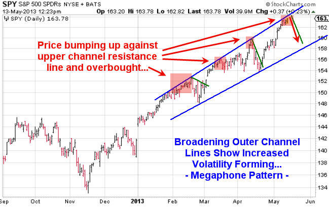
SPY ETF Trading Chart Shows Instability and Resistance:

Using simple trend line analysis we see the equities market is trading at resistance and sideways or lower prices are more likely in the next week or two.


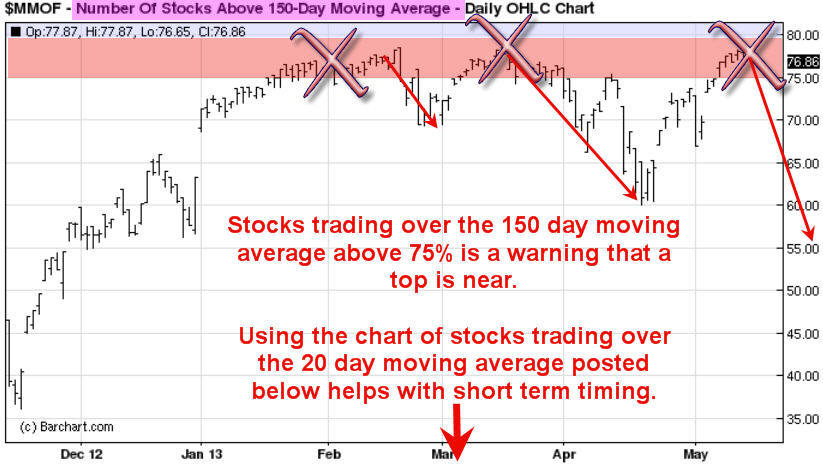
Stocks Trading Above 150 Day Moving Average Chart:

This chart because it’s based on a very long term moving average (150sma) is a slow mover and does not work well for timing traded. But with that said it does clearly warn you when stocks are getting a little overpriced and sellers could start at any time.

General rule is not to invest money on the long side when this chart is above the 75% level. Rather wait for a pullback below it.


Stocks Trading Above 20 Day Moving Average Chart:

This chart is based on the 20 day moving average which moves quickly. Because it reacts quicker to recent price action it can be a great help in timing an entry point for a market top or bottom. It does not pin point the day/top it does give you a one or two week window of when price should start to correct.


How to Spot and Time Stock Market Tops Conclusion:

As we all know or will soon find out, trading is one of the toughest businesses or and one of the most expensive hobbies that one will try to master. Hence the 95-99% failure rate of individuals who try to understand how the market functions, position management, how to control their own emotions and to create/follow a winning strategy.

With over 8000 public traded stocks, exchange traded funds, options, bonds, commodities, futures, forex, currencies etc… to pick from its easy to get overwhelmed and just start doing more or less random trades without a proven, documented rule based strategy. This type of trading results in frustration, loss of money and the eventual closure of a trading account. During this process most individuals will also lose friends, family and in many cased self-confidence.

So the next time you think about betting against the trend to pick a top or a bottom you better make darn sure you have waited well beyond the first day you feel like the market is topping out. Stocks trading over the 150 and 20 day moving averages should be in the upper reversal zones and money should be flowing out of bonds and other safe haven/defensive stocks to fuel the last rally/surge higher in the broad market.

Also I would like to note that I do follow the index futures and volume very closely on both the intraday and daily charts. This is where the big money does a lot of trading. Knowing when futures contracts are being sold or bought with heavy volume is very important data in helping time tops and bottoms more accurately. And the more experience you have in trading also plays a large part in your success in trading tops and bottoms.

 

Posted in Markets, Technical Analysis.


Noteworthy News – May 13, 2013

Economy:

Thinking Utopian: How about a universal basic income? – Washington Post

The Problem with Poor Countries’ GDP – Project Syndicate (Bill Gates)

Spain is officially insolvent: get your money out while you still can – Telegraph

On the Payoff to Attending an Elite College – National Bureau of Economic Research

In U.S., Standard of Living Perceptions Hit Five-Year High – Gallup

Markets:

Researchers present causal evidence on how markets affect moral values – Phys.org

Inflation Madness – New York Times (Krugman)

Challenge to Dogma on Owning a Home – New York Times

Foreign Buyers Hop on Rental Trend – Wall Street Journal

Robert Shiller: Home Prices Will Remain Relatively Stagnant For Next 10 Years – Yahoo! Finance

Stock Markets Rise, but Half of Americans Don’t Benefit – New York Times

Politics:

Escaping liquidity traps: Lessons from the UK’s 1930s escape – Vox

The Salvation of Japan: Prime Minister Shinzo Abe’s bold recovery strategy is working – Slate

Banks:

Wall Street is back: American investment banks dominate global finance once more. That’s not necessarily good for America – Economist

Bankers: College debt bubble mimics housing bubble – USA Today

Fannie Mae to Pay Treasury $59.4 Billion After Record Profit – Bloomberg


Posted in Economics, Markets, Media, Politics.


Race to Zero in High Yield Credit

The average annual credit loss in high yield bond portfolios was 2.65% between 1992 and 2011.  During that same time period, your average yield for taking that credit risk was 10.25% and your average option adjusted spread was 5.7% .  Today, that total yield has dropped to 4.96%

High Yield - The New Risk Free Asset Class

At 4.96% you are picking up 4.04% above a comparable tenor in US treasuries.   With a 2.65% average credit loss, you are expecting a 1.39% risk premium for taking on junk credit risk if we experience historical average credit losses.  Do not worry though, because volatility has been removed from all asset classes.

Posted in Markets.

Tagged with , , , .


Where is the Vol?

Once again we find ourselves in a market of complacency.  The VIX closed at 12.66 today which puts it in about the 13th percentile since 1990:

Nothing to see here!

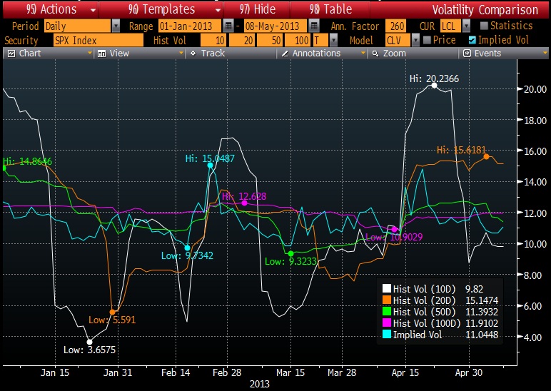
What is fun to notice in this all-time high flying market is that the 20 day trailing volatility is 15.6% while the 10 day is 9.8% and the 50-100 day are 11-12%.  So basically the VIX is telling you that the little risk flare a few weeks back was nothing but a fluke:

So riddle me this – Is the 10 year treasury at 1.76% telling me

  1. that bonds are an inferior investment and we should all be plowing into equities
  2. that QE is an infinite cure to the common cold and interest rates no longer matter (so plow into equities)
  3. that a 1.76% yield combined with 1.5% inflation might just predict a rather sour economic environment

Thank you Ben and fellow global central bankers, you have succeeded in luring the sheep back into the chase for yield in one final and glorious conclusion.


Posted in Economics, Markets, Politics.

Tagged with , , , , , , , .


Replicating VXX or VXZ

With a little bit of elbow grease and some knowledge of programming in VBA or another language, you too can recreate the indices represented by VXX, VXZ, or maybe even your own volatility futures index.

The VIX Futures data is available historically going back to 2004 from the CBOE Futures Exchange.  You just need to bring all of the data into a framework that is easily understood from a programmatic standpoint.  You can download the data here or shoot me an email if you need assistance.

The second step is to dig into the prospectus for VXX and VXZ.  There is actually quite a bit of information available, just jump to page 20 and 21 of the following pdf:

[Download not found]

If the math is scary, you probably do not want to tackle this project

Once you are able to meld the formula with the underlying VIX Futures data, you will be pleasantly surprised at how accurate your own estimate of the index is:

You will not be pleasantly surprised to know that if you invested $100 in VXX at the beginning of 2008, you would have ~$2.70 today…

Posted in Derivatives, Educational.

Tagged with , , , , , , , .


Copyright © 2009-2013 SurlyTrader DISCLAIMER The commentary on this blog is not meant to be taken as an investment advice. The author is not a registered investment adviser. There is no substitute for your own due diligence. Please be aware that investing is inherently a risky business and if you chose to follow any of the advice on this site, then you are accepting the risks associated with that investment. The Author may have also taken positions in the stocks or investments that are being discussed and the author may change his position at any time without warning.

Yellow Pages for USA and Canada SurlyTrader - Blogged

ypblogs.com