Nice infographic from Crisp360 showing where the United States is losing jobs and where it is creating jobs
Where Jobs are Gained and Lost
Posted in Economics.
Comments Off on Where Jobs are Gained and Lost
– January 24, 2012
Growing Disconnect
It seems challenging to interpret the continued discrepancy between the current level of US interest rates along with the current levels of risky assets. The VIX has dropped, realized volatility is low, credit spreads have tightened in and the equity market is close to its 3+ year highs…yet the 30 year treasury yield seems anchored to about 3%:
There is some validity in stating that the Federal Reserve is keeping interest rates low, but I do not believe that the continued low yields in the 10 year treasury and beyond can merely be attributed to the Fed’s purchasing of treasuries or verbal commitment to low interest rates. The current inflation rate, as measured by CPI, is running at 3% which implies that the yield you earn over a year’s time by owning a 30 year treasury bond is entirely eaten away by inflation.
Now comes the investment aspect of it – why would you be willing to invest at a zero rate of return AND expose yourself to the risk that interest rates increase or inflation is greater than current levels or future expectations? Bonds, even those issued by the treasury, are not riskless. If 30 year interest rates increase by 1%, you can expect to lose 15%+ of your investment on a market value basis.
The bottom line is that the buyers of bonds are making a very different call than the buyers of equities. I have a difficult time believing that it is truly an artifact of Fed intervention or even a flow of investment from non-US institutions and governments into the dollar. I maintain that one of the markets is wrong.
As you can see from chart above, the S&P 500 is testing a downward trendline that started in 2007. It will be truly interesting to see if it bounces off of these levels as the euphoria fades. Peak profit margins have probably been reached and it is doubtful that strong growth will be driven by increased top line revenues.
Posted in Economics, Markets, Media, Politics, Technical Analysis.
– January 23, 2012
Noteworthy News – January 23, 2012
Economy:
How the U.S. Lost Out on iPhone Work – New York Times
3 Huge Recent Economic Developments You May Have Missed – Motley Fool
What the Top 1% of Earners Majored In – New York Times
Markets:
Stocks up on upbeat economic reports – US Today
GLOBAL MARKETS-Shares, euro stabilise, economic data eyed – Reuters
Will Emerging Markets Fall in 2012? – Project Syndicate
The mathematics of markets – Economist
Currencies, Prices, and Mike Mussa (A Bit Wonkish) – New York Times (Krugman)
Politics:
Corn Subsidies** in the United States totaled $77.1 billion from 1995-2010 – Environmental Working Group
The Dangerous Notion That Debt Doesn’t Matter – New York Times
Banks:
New Normal on Wall Street: Smaller and Restrained – DealBook
Economic Data Lift Wall Street, But Banks Drag – Fox Business
UK Banks Navigate Challenging Economy in 2012 – MarketWatch
Posted in Economics, Markets, Media, Politics.
– January 22, 2012
The Fall of Detroit
The most recent census showed that in the decade from 2000 to 2010 Detroit lost an astonishing 25% of its population. This makes Detroit the 18th largest city in the United States at a population of 713,777. The decline in population is only half the problem, the other half resides in their $12.3B of outstanding debt, along with well over $5B in promised benefits and unfunded pension funds. In total, the Citizen’s Research Council of Michigan puts the long-term debt burden at about $20B. That ends up being about $28,000 per (remaining) resident of the fine city of Detroit. That is on top of the ~$49,000 per US Citizen based on the current US National Debt.
Posted in Economics, Politics.
Comments Off on The Fall of Detroit
– January 17, 2012
Gold Trend Forecast for 1st Quarter 2012
Guest Post from Chris Vermeulen at TheGoldandOilGuy.com
Over the past five months gold has fallen sharply and is no longer headline news which it once dominated back in 2011 when it was making new highs every day. The shiny metal has been under pressure because traders and investors started to pull some money off the table to lock in gains. Gold prices had surged so fast most advanced traders knew that final high volume surge was not sustainable. But the main reason gold topped out in my opinion was because the US Dollar index had put in a bottom and started to build a base. As we all know a rising dollar typically means lower stocks and commodity prices.
I have posted some charts below covering gold in detail using multiple time frames. The weekly which is long term, daily which is the intermediate trend and the 4 hour chart which shows gold momentum and intraday action. At the very bottom I talk about the US Dollar and what is happening with that.
Gold Weekly Long Term Trend Analysis
The weekly chart is not the most exciting time frame to follow as you will grow old watching it. That being said it is crucial for understanding the long term trend, price and volume analysis.
Below you can see that gold’s recent pullback has been a 3 wave correction, which is a normal pullback for any investment. But taking into account the rally from 2008 – 2011 I feel this pullback will have one more low put in before bottoming out. This would make for a 5 wave correction much like what happened in 2008.
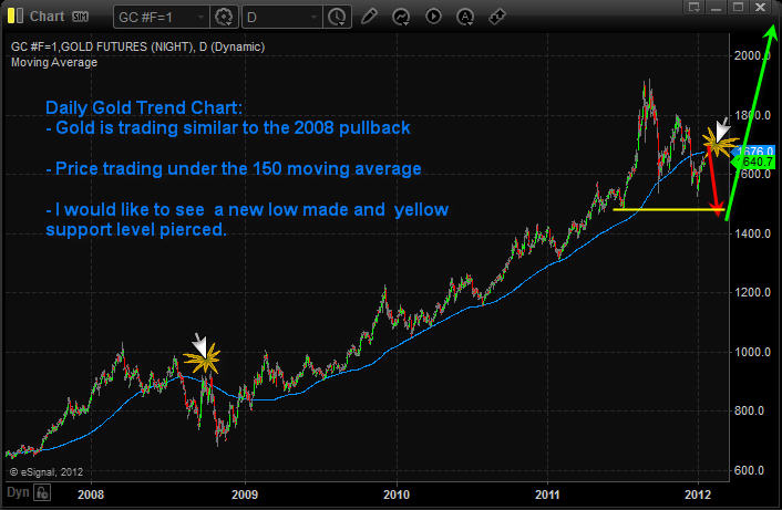
Daily Chart of Gold Showing the Intermediate Trend
The daily chart allows us to see gold intra-week price action and use the 150 moving average which is my preferred daily moving average. As you can see we are getting a similar pullback as 2008 with gold now trading under the 150 MA.
I would like to see gold make another lower low in the next 2-3 months. If that happens I feel it complete the correction and trigger a strong multi month or multiyear rally in gold.
4 Hour Intraday Chart of Gold
The 4 hour chart of gold allows us to see all the intraday price action which would normally not be seen with a daily chart. It also gives us enough data to build our analysis upon.
My preferred setup for gold which I feel if happens will trigger major buying in the yellow metal. If/when we get a rally in gold would also likely mean some more economic uncertainty has entered the market either from within the USA, Europe or China…
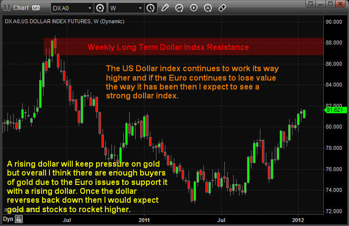
Weekly Dollar Index Long Term Analysis
The dollar has the potential to rally to the 87 – 88 level before putting in a major top. For this to happen we will need to see the Euro crumble (both currency and countries divide) in my opinion.
If you look at the weekly chart of gold and this chart of the dollar index you will notice that gold topped when the dollar bottomed. Over the past couple year’s gold and the dollar have had an inverse relationship to each other.
With all kinds of crap about to hit the fan overseas I think it’s very possible gold will rally with the dollar. Reason being there is way more people overseas who want to unload their euro’s and with all the negative talk and doubt with the US Dollar individuals will naturally want to buy more gold.
Weekend Trend Trading Conclusion:
In short, I expect a bumpy ride for both stocks and commodities in the first quarter of 2012. With any luck gold will pull back into my price zone shaking the majority of short term traders out just before it bottoms. And we will be positioning ourselves for a strong rally buying into their panic selling.
To just touch base on the general stock market quickly. I have a very bearish outlook for stocks. If the dollar continues to rise it is very likely the stock market will fall into a bear market. So I am VERY cautious with stock at this time.
Posted in Markets, Technical Analysis, Trading Ideas.
– January 16, 2012


