Skip to content


Gold and Silver Nearing MAJOR Long Term Support


Guest Post from Chris Vermeulen at TheGoldandOilGuy.com

Gold and silver along with their related miners have been under a lot of selling pressure the last few months. Prices have fallen far enough to make most traders and investors start to panic and close out their long term positions which is a bullish signal in my opinion.

My trading tactic for both swing trading and day trading thrive on entering and exiting positions when panic trading hits an investment. General rule of thumb is to buy when others are extremely fearful and cannot hold on to a losing position any longer. When they are selling I am usually slowly accumulating a long position.

Looking at the charts below of gold and silver you can see the strong selling over the past two weeks.When you get drops this sharp investors tend to focus on their account statements watching the value drop at an accelerated rate to the point where they ignore the charts and just liquidate everything they have to preserve their capital.

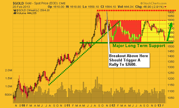
Gold Bullion Weekly Chart:

The price and outlook of gold has not really changed much in the past year. It remains in a major bullmarket and has been taking a breather, nothing more. Stepping back and reviewing the weekly chart it’sclear that gold is nearing long term support. With panic selling hitting the gold market and long termsupport only $20 – $30 dollars away this investment starts to look really tasty.

But if price breaks below the $1540 level and closed down there on a weekly basis then all bets are off as this would trigger a wave of selling that would make the recent selling look insignificant. And theuptrend in gold would now be over.

Silver Bullion Weekly Chart:

Silver price is in the same boat as its big sister (Yellow Gold). Only difference is that silver has larger price swings of 2-3x more than gold. This is what attracts more traders and investors but unfortunately the masses do not know how to manage leveraged investments like this and end up losing their shirts.

A breakdown below the $26.11 price would likely trigger a sharp drop back down to the $17.50 level so be careful…


Gold Mining Stocks – Monthly Chart:

If you wanna see a scary chart then look at what could happen or is happening to gold miner stocks. This very could be happening as we speak and why I have been pounding the table for months no to get long gold, silver or miners until we see complete panic selling or a bullish basing pattern form on the charts. We have not seen either of these things take place although panic selling is slowly ramping up this week.

There will be some very frustrated gold bugs if they take another 33% hair cut in value…


Precious Metals Trend and Trading Conclusion:In short, the precious metal sector remains in a cyclical bull market. That being said and looking at the daily charts the prices have been consolidating and are in a down trend currently. Until we see some type of bottoming pattern or price action form it is best to sit on the side lines and watch the emotional traders get caught up and do the wrong thing.

The next two weeks will be crucial for gold, silver and miner stocks. If metals cannot find support and close below the key support levels things could get really ugly fast.
Posted in Markets, Technical Analysis, Trading Ideas.

Tagged with , , , , .


Is Skew Signalling a Pullback?

There is one fact that I can easily state: there is not a single indicator that works all of the time.  Despite that, there are some indicators that I tend to like.  The CSFB “Fear Barometer” is one of them.  As a rehash of what this indicator measures:

The Fear Barometer is a way to measure skew in a consistent format through the pricing of a “zero-cost collar”. The index assumes that you sell a 3-month, 10% out of the money call and use the proceeds to purchase a 3-month out of the money put. The moneyness of the put option that you can afford is the index itself, so if the index is at 25 it implies that you can purchase a 3-month put 25% out of the money with the premium that you received from selling the 10% OTM 3 month call.

In that same post on April 4, 2011 I made the following statement:

Of course there is no one perfect predictor of market tops and bottoms, but I will say that this peak stands out and should be noted. It certainly does not give me a comfortable backdrop for being overly bullish.

I will gladly make the same statement today with the CSFB index level currently sitting at 32.11 (close to all time high):

The record level in the 30's is an interesting dynamic in the options markets

If you want to rationalize why the skew is so high you could make the following statements about option market sentiment:

  1. Low demand from call buyers (bearish)
  2. High supply of call sellers (bearish)
  3. High demand of put/protection buyers (bearish)

I am not sure that the supply of put sellers is ever a true driver of skew so I will leave that out of the mix.

The S&P 500 is less than 35 points away from its all time price index high so it seems to be a foregone conclusions that those highs will be touched.  The question is whether 2013 is shaping up to have a May-October risk-off pattern that we have seen in the last few years:

Sell in May…or maybe April?

It seemed like 2012 was a rather kind year from the markets.  It might be that a bit more turbulence is brewing for 2013.

Posted in Markets, Technical Analysis, Trading Ideas.

Tagged with , , , , , .


Noteworthy News – February 18, 2013

Economy:

Wal-Mart Executives Sweat Slow February Start in E-Mails – Bloomberg

Economy in Europe Contracts More Than Expected – New York Times

Sorry Mr. President, Manufacturing Will Not Save Us – Atlantic

Economists disagree on whether the minimum wage kills jobs. Why? – Washington Post

The Right Minimum Wage: $0.00 – New York Times

Stats of the union – Economist

Markets:

Fracking Threatens OPEC as U.S. Output at 20-Year High – Bloomberg

Currency fears spread in Latin America – Financial Times

Politics:

Generational Theft Needs to Be Arrested – Wall Street Journal

New Data Suggests Obamacare Is Actually Bending The Healthcare Cost Curve – Forbes

For Obama, State of the Union Means State of the People – Fiscal Times

The Coming Fiscal Tsunami – Hoover Institution

In Kansas, A ‘Glide Path’ To No Income Taxes. Will It Work? – NPR

Banks:

Don’t Blink, or You’ll Miss Another Bailout – New York Times

Posted in Economics, Markets, Media, Politics.


Market Volatility and Returns

Do returns dictate volatility or does volatility dictate returns?  It might seem like a silly question, but one that is worth spending a bit of time on.  If market returns actually followed normal distributions, then we might expect that there are as many up days as down days and upside deviation equals downside deviation.  Unfortunately, the distribution of returns is rather non-normal with a larger number of negative returns and a lot of small positive returns.  You can read about option pricing and equity return distributions at a popular old post, “Do Black Swans Negate Option Premiums“.

The question for today is whether volatility necessarily means that returns are negative.  For this little bit of analysis, we will look at the S&P 500 daily returns going back to 1928.  The data is calculated into calendar month statistic sets and then the sets are grouped by realized volatility buckets:

Monthly returns for low volatility months are higher than high volatility months

The data is pretty consistent across all metrics.  Low realized volatility generally corresponds to higher average returns whereas high realized volatility generally corresponds to lower average returns.  We can also see that (as expected and almost by definition) the dispersion between the highest and lowest returns increases as the volatility increases.

The question that arises is whether this has practical implications.  It has almost become an industry accepted fact that no one can predict the equity market.  Has it also become a fact that no one can predict future market volatility?  A quick google search would show you that there is quite a lot of literature that suggests volatility is much easier to predict.

Posted in Markets, Trading Ideas.

Tagged with , , , , , , , , .


Noteworthy News – February 11, 2013

Economy:

Harvard Losing Out to South Dakota in Graduate Pay: Commodities – Bloomberg

The Worst Five Years Since the Great Depression – Forbes

Oil Exports Trim U.S. Deficit as Fuel Gap Shrinks: Economy – Bloomberg

More Losers Than Winners in America’s New Economic Geography – Atlantic

Markets:

Should the Fed pop bubbles by raising interest rates? – Washington Post

Oil price, inflation, IIP nos to guide market this week – Economic Times

Euro choppy, yen struggles to hold its ground – Reuters

Politics:

Fed’s Holdings of U.S. Gov’t Debt Hit Record $1,696,691,000,000; Up 257% Under Obama – CNSNews

Chavez Risks Backlash After Venezuela Devalues Bolivar 32% – Bloomberg

ACA premium sticker shock could fuel foes – Politico

Postmaster Delivers His Challenge to Congress – Bloomberg

Dell’s Gigantic Tax Dodge – Slate

Banks:

The Real—and Simple—Equation That Killed Wall Street – Scientific American


Posted in Economics, Markets, Media, Politics.


Copyright © 2009-2013 SurlyTrader DISCLAIMER The commentary on this blog is not meant to be taken as an investment advice. The author is not a registered investment adviser. There is no substitute for your own due diligence. Please be aware that investing is inherently a risky business and if you chose to follow any of the advice on this site, then you are accepting the risks associated with that investment. The Author may have also taken positions in the stocks or investments that are being discussed and the author may change his position at any time without warning.

Yellow Pages for USA and Canada SurlyTrader - Blogged

ypblogs.com