Skip to content


Inflation Actually Rising

MIT had the bright idea of not trusting the government’s CPI numbers, so they came up with their own and called it the “Billion Price Index”.  According to their website:

BPP Database Key Facts

  • Statistics updated every day
  • 5 million individual items
  • 70 countries
  • Started in October of 2007
  • Supermarkets, electronics, apparel, furniture, real estate, and more

Data collection: our data are collected every day from online retailers using a software that scans the underlying code in public webpages and stores the relevant price information in a database. The resulting dataset contains daily prices on the full array of products sold by these retailers. Our data include information on product descriptions, package sizes, brands, special characteristics

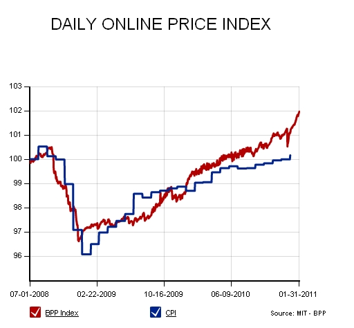
So what does it show?  Well, it certainly appears as if inflation is heating up:

The BPP Index almost appears to be spiking...

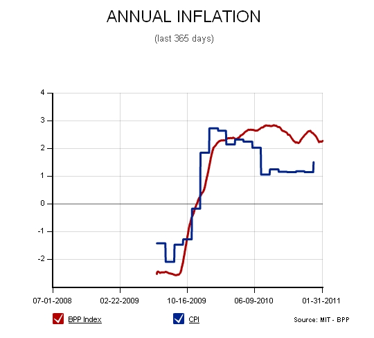
What is probably most important is the annual inflation rate gap between the BPP and the CPI:

Will the Gap grow?

The gap between the CPI and what MIT would call true inflation is important because the longer the government can maintain a gap between the two, the further the reduction in real debt.  The dollar is depreciated and pension or health care obligations in real terms go down (because most are linked to CPI).

Just how much can they hide and for how long is the question.

Posted in Economics, Markets.

Tagged with , , , , , , .


Where Can VIX Futures Go?

Since we have seen a very steady decline in VIX futures across the curve, I thought it was an opportune time to look at how VIX futures behaved in the last few years.  It is hard to say that we will decline back to pre-2007 levels considering the crisis we have been through, the huge government deficits, and the continued weak employment levels and housing market.  That being said, I think it is good to get a perspective of what I believe would be a floor to what we should expect.

By looking at the 5th month VIX futures contract over time, I pinpointed a few different spots in the last couple of years that I thought would be interesting to look at relative to today.  Each point marked a low within its own slice of time:

What a wild ride vol took

With these spots in time marked, now we need to dive into what the VIX futures curve looked like at the time:

An outlier and clustering

Some observations from the above data:

  • First: The most obvious observation is that early 2007 was leaps and bounds lower than the other observations.  That time period was marked by stable and calm markets with little relative price risk.
  • Second: The other4 curves are fairly clustered, possibly giving some credence to the idea that the October 2007 levels could act as a floor in the near term.
  • Third: The lows in ’07 and ’08 were marked by a much flatter curve.  Even though May 08 was elevated, there was little spread between maturities
  • Fourth: Current levels are lower than our 2010 lows pre-Eurozone crisis
  • Fifth: The most important observation in my mind is that the front part of the current curve almost looks cheap at these levels.

This information is rather subjective since I chose the points that I thought would be most indicative for comparison,but I think it does provide some perspective on our current VIX curve.  In my opinion, the 17-18 front vol looks fairly cheap compared to the past, especially if you believe that a reversion to 2006-2007 volatility levels will not happen in a straight line.   It would also seem to make sense that if we believe that the calm markets will persist for the next few months, then we should expect the current curve to flatten out significantly.  A curve flattener position in which you are long the front months and short the further out months would make most sense in that situation as long as you do not believe the VIX index is headed to 10%….

Posted in Markets, Trading Ideas.

Tagged with , , , , , , .


Silver Butterfly: An Option Trading Lesson

(Guest Post: JW Jones from www.OptionsTradingSignals.com)

One of the notes that I keep stuck to my computer reads “remember seasonality”. For those just now becoming familiar with options, you may assume I am reminding myself not to forget deer season or the opening of the season for striper fishing. While these are important dates for many of us to remember, I am reminding myself that there are distinct periods within the options expiration cycle where certain trades work better and give a competitive advantage to the trader who recognizes and takes advantage of this seasonal pattern.

As a quick review, remember that option cycles historically have been established with monthly expiration cycles. For the knowledgeable option trader, different time periods within this monthly cycle are known to have distinct characteristics. The primary reason for these different characteristics is the “non linear” decay of time premium.

This “non linear” behavior simply means that the decay of time premium accelerates as expiration approaches; for us visual thinkers, envision a snowball rolling downhill. The recent arrival of weekly options has opened a whole new concept of seasonality for traders using those vehicles, but that is a discussion for a future time.

The butterfly is one of the option constructions most affected by seasonality. The last two weeks of the monthly option cycle is even called “butterfly season” by many option traders. The classic behavior of butterflies is that they are only slightly impacted by changes in the price of the underlying early in the cycle and exhibit increasing response to price change late in the option cycle. This peculiar functional characteristic has frustrated many traders who have tried to employ butterflies early in the options cycle and have routinely seen the correctly predicted price action result in minimal or no profit in the position.

For those of you unfamiliar with this construction, let’s look at an example. First and foremost, we need to be aware of our position in the cycle. February options expire Friday, February18, this is 17 days from today. That is close enough to the mid point of the cycle to be open season for butterflies.

The essential structure of a butterfly is to establish a spread in either calls or puts that has the structure +1/-2/+1. The spread uses options which all expire in the same month. A variant of the classic butterfly, the iron butterfly, uses both puts and calls but this metallic beast will need to be the subject of another post.

Since a picture is worth “a thousand words”, let’s look at an example of a butterfly structure before we discuss some of the nuances of which the trader must be aware. Now, don’t go out and put this on, it should be used only as an example and not a trade recommendation or financial advice! This trade is to demonstrate the butterfly structure and to lead us to some functional considerations. The trade is that of a put butterfly in SLV.

As you can see the position is slightly bearish, with maximum profit occurring at expiration at the SLV price of 26. For those who are bullish or even neutral, a similar trade could be constructed to reflect that viewpoint. An important point is to notice the difference in the solid blue line, the expiration P&L graph, and the intermediate time frames indicated by the broken lines. As is readily apparent, the sensitivity of the position to price movement is much less at points in time prior to expiration.

A key point to remember when trading butterflies is that maximum profit is ALWAYS when the price of the underlying, in this case SLV, is at the short strike at expiration. By remembering this fundamental characteristic, an option trader can center the butterfly on his projected price target in order to maximize profit.

Another fundamental characteristic of the butterfly construction is that this structure usually works best in an implied volatility environment that is in the upper half of its historic range. What is the reason for this characteristic? The options we sell short in the center of the butterfly represent a major profit engine for the structure. If these options are somewhat “rich”, as indicated by the calculated level of implied volatility, they provide a substantial boost as the time premium we are short decays into expiration.

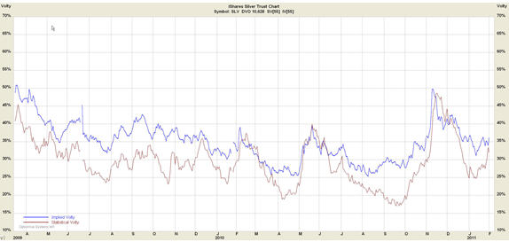
How does the butterfly under discussion fit into the volatility consideration? Below is the volatility chart for SLV. The brown line is the volatility actually demonstrated in the market recently, and the blue line is the implied volatility calculated from actual option trades. As you can see, we are currently in the mid range of volatility for this underlying. This is a good place to be for an options trade, and provides an additional “tailwind” for the trade together with our current position in the time of the option expiration cycle.
Successful option traders understand the limitations and advantages of the vehicles available to them. The butterfly can deliver outstanding risk/reward scenarios, and the probability of its success is enhanced by understanding the nuances of its use.
Posted in Derivatives, Markets.

Tagged with , , , , , .


Today’s Option Blogs February 1, 2011


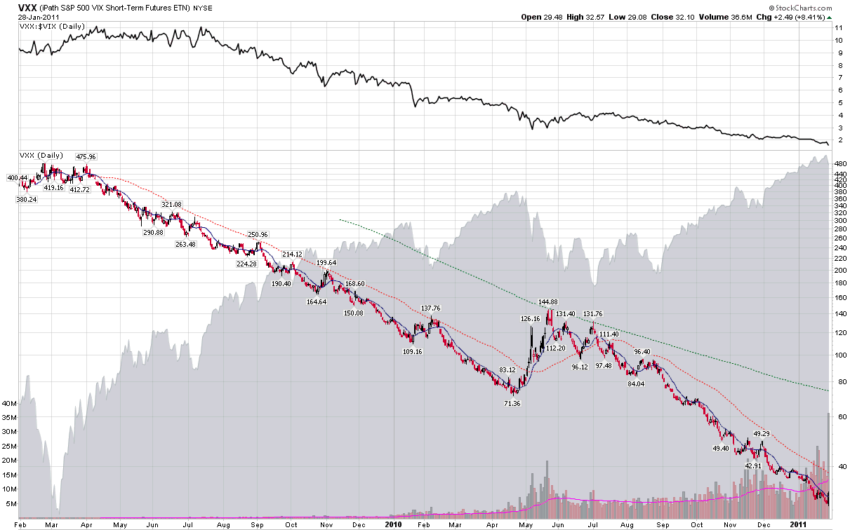
Chart of the Week: VXX Celebrates 2nd Birthday

(VIX AND MORE)

One year ago today, in Chart of the Week: VXX Celebrates One Year of Futility, I chronicled the first year of the iPath S&P 500 VIX Short-Term Futures ETN, known to most by its ticker symbol, VXX. At the time, I noted that VXX had fallen 68.4% in its first year and made the prediction, “I expect VXX to perform better relative to the VIX in its second year than it did in its first year, though admittedly this is not a very high bar to clear.”

Well, low bar or not, the performance of VXX was even worse in its second year than in its first year. In spite of the fact that VXX rallied 8.4% on Friday to close out the second year on a high note, its performance in the second year slipped to -74.6%, giving the ETN the dubious distinction of having fallen 92% since its launch two years ago.

While I have been chronicling the shortcomings of VXX for the better part of these past two years, let me go on record as saying that VXX does exactly what it sets out to do: capture a portfolio of VIX futures with a constant maturity of 30 days, with daily rolling used in order to achieve the constant maturity. As detailed in the links below and in many other places in this blog, it is the daily rolling in the face of persistent contango which triggers negative roll yield and acts as a drag on the price of VXX. In fact, VIX futures contango has been extremely elevated since the end of August, which largely explains why VXX lost 74.6% in the past year when the VIX declined only 18.6%. To compare the contango impact of the second year of VXX with the first year, all one needs to know is that in the first year VIX outperformed VXX by 26.2%, while in the year just concluded, VIX outperformed VXX by a whopping 56.0%.

This does not mean that investors should shun VIX as a volatility trade. In the short-term, VXX is a viable long volatility play, as evidenced by Friday’s 8.4% gain. When the VIX futures curve slides from contango to backwardation, VXX can also be an attractive trade. The problems on the long side begin when investors utilize holding periods of more than a couple of days. In the long run, volatility is mean-reverting and offers no natural directional advantage. For this reason, the longer the holding period, the more VXX trades become term structure rather than directional trades, with the term structure favoring contango over backwardation approximately 75% of the time.

With this in mind, I will repeat the same prediction I made one year ago, undaunted: VXX will perform better relative to the VIX in the coming year than it has in the past year.

Related posts:

[source: StockCharts.com]
Disclosure(s): short VXX and VIX at time of writing


  • VIX-Plosion 2011
    Quite the green candle in VIX on Friday. After meandering for the week, VIX exploded 24% on Friday, the largest single day pop since those Flash Crash days of last May. What’s it all mean? Well of course, we won’t know until this plays out. But its not uncommon to see rushes for volatility like […]

Posted in Markets, Trading Ideas.

Tagged with , , , , , .


Millionaires Defaulting on Mortgages

As an update to the articles that I wrote about a year ago regarding strategic defaults, it is time to revisit the continued problems with the housing market.    It turns out that one in seven homeowners with loans over $1 million are seriously delinquent compared to one in 12 with mortgages below $1 million.  In addition to leaving the banks with a larger loss, the homeowners who stop making their payments get to stay in their houses longer because the banks are less interested in foreclosing on million dollar properties.  The banks are disinterested to take back the properties because they are harder to move on the market and would require that the banks to pay hefty maintenance fees on the properties for upkeep.

From CBS News:

For Darren Thomas that ocean view was quickly losing its value. He says, “I bought it for [$1.385 million]. It is worth less than [$800,000], maybe less.”

Thomas bought his townhome in 2006 but after seeing its value drop steadily he stopped paying.

“I haven’t made a payment in two years,” he says. “It was business decision. It was an easy decision. I have a property worth six or 700,000 less than when I bought it. I was making payments of 10,000 a month.”

“People like myself, business people, are going it is silly to throw good money after bad,” says Thomas “The loss is not mine. The loss is the banks.”

Actually Darren Thomas, since the government bailed out and continues to finance the banks at zero interest, the loss is ultimately born by the taxpayers.  You can say thank you to your fellow citizens any day now.

Posted in Economics, Markets, Media, Politics.

Tagged with , , , , , , , .


Copyright © 2009-2013 SurlyTrader DISCLAIMER The commentary on this blog is not meant to be taken as an investment advice. The author is not a registered investment adviser. There is no substitute for your own due diligence. Please be aware that investing is inherently a risky business and if you chose to follow any of the advice on this site, then you are accepting the risks associated with that investment. The Author may have also taken positions in the stocks or investments that are being discussed and the author may change his position at any time without warning.

Yellow Pages for USA and Canada SurlyTrader - Blogged

ypblogs.com