Skip to content


A Blessing of Higher Interest Rates?

Since April 2012 the 10 year treasury yield has been below 2%.  This yield has sustained for months even though the market has been showing a 10 year break-even inflation rate of about 2.5%.  Treasury investors have been locking in negative real yields without a second hesitation.  With the recent decline in treasury prices, we are about to poke our heads above 2% for the first time in about 9 months:

Could we be looking at a new trading range for the 10Y?

Why should you hope for higher interest rates?

  1. The federal reserve might acknowledge that the market no longer reacts to its stimulus, thereby shortening the Fed’s market meddling (unlikely)
  2. Investors in fixed income (seniors/retirees, pension funds, insurance companies) will no longer be bled through an inflation tax
  3. Investors will no longer be incentivized to make bad investments by seeking ever increasingly risky projects (market bubble 3.0)
  4. Any institution with long dated liabilities (pension funds) will see the value of those liabilities decrease as the discounting rate on those cash flows increases

Unfortunately, a large increase in interest rates is probably unlikely until A) the Fed stops or B) the market loses faith in the US government’s capacity to pay its debts.  A) won’t happen because the Fed is full of conviction and B) probably won’t happen because Japan has been getting away with deficit murder for far longer.

The contrarian indicator to this hopeful market breakout is the fact that treasury put volume has hit its second highest level *ever*.  Second only to June 2007:


I would hate to see where interest rates go if this is a predictive indicator…

Posted in Markets.

Tagged with , .


Traders Take a Bite out of Apple

What is $30B among friends?

Apple revenue falls short again, iPhone sales disappoint

Posted in Markets, Media.

Tagged with , , .


VIX: Race to the Bottom

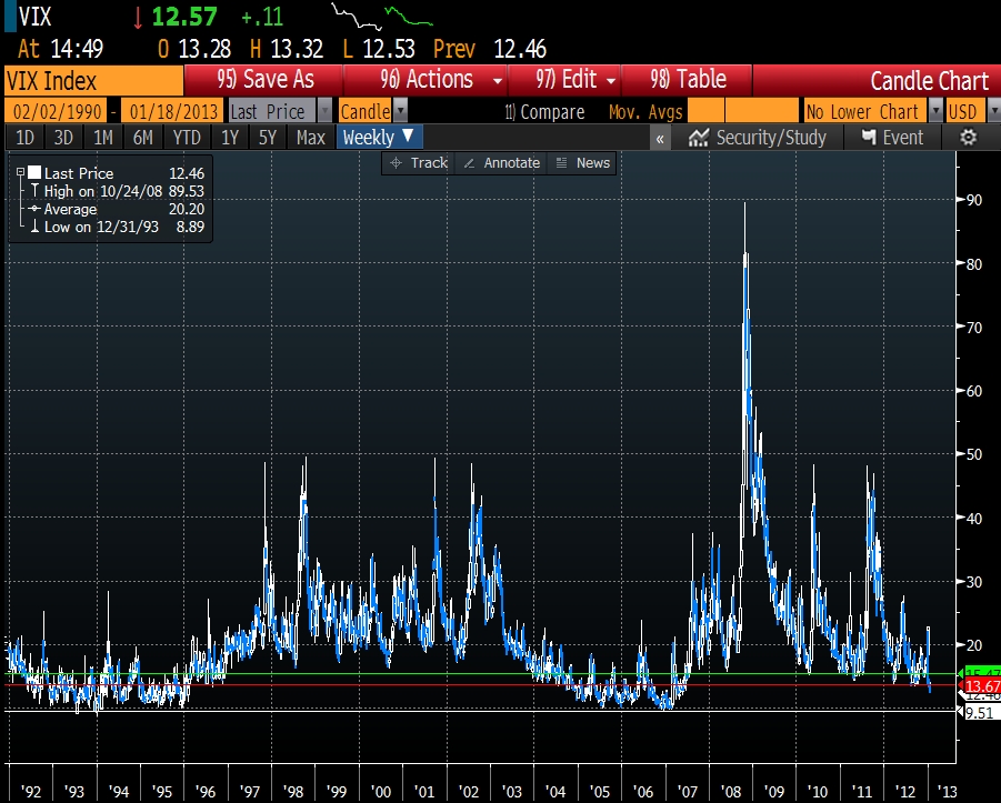
There is one truth in the market that every decent trader has to embrace: “You cannot fight the market.”  No matter how strong you feelings are, you must always be able admit you are wrong and to walk away in order pull the trigger at a later date.  It seemed that ~13 was a good barrier for the vix, but the market said otherwise as we crash towards all time lows:

I do have a bias that volatility will be elevated in the longer horizon due to all of the debt on developed nations’ balance sheets.  Take the Japanese market as a possible indication with a 30 day realized volatility of about 22% between 1991 and 2001:

Some short periods of calm, but generally a turbulent ride

Despite my opinion, the quick and strong collapse in the VIX could indicate market sentiment that could persist in the near-term, especially with a “kick the can down the road” resolution on the debt ceiling and rather apathetic market participants in the early part of the year.  With that as a backdrop, I decided to take a look at all of the prior periods in market history since the inception of the VIX that

  1. The VIX was below 16 and
  2. The VIX was trading lower than the last 20 trading days of historic volatility

The results were somewhat surprising.  First, this is a rare event.  This condition was met on 102 of the 5788 trading days in the test or just 1.76% of the time.  Secondly, the returns in the 1, 2, and 3 months following this condition were mostly strong for the S&P 500 with an average return of 1.7%, 3.15% and 3.99% respectively:

On average the VIX modestly declined from its starting level, but the potential for strong upside was greater due to the depressed starting point.

Bottom line: history tells us it is a fairly bullish setup in early 2013.

Posted in Markets.

Tagged with , , , , .


The Non-existent Wage Gap

The Federal Reserve Bank of St. Louis dug into the gender wage gap a bit more than most.   They show that the raw wage gap has declined from 36.5% in 1979 to 16.5% in 2011:

The Bureau of Labor Statistics reports that in 1979 median weekly earnings of full-time female workers were 63.5 percent of male workers’ earnings, implying a gap of 36.5 percent. The earnings gap dropped to 30 percent in 1989 and to 23.7 percent in 1999. In the second quarter of 2011, the gap reached a low of 16.5 percent.

They also note that women often do not have the same educational background and do not pursue some of the higher paying jobs in the economy:

First, women are likely to work fewer hours than men, which would make a gap in weekly earnings between the two groups substantial even if their hourly wages are the same. For this reason, most economic studies of a gender gap, including all of the studies reviewed in this article, use hourly wages instead of weekly earnings as a measure. Second, many other factors (such as education and labor force attachment) could affect wages. Research suggests that the actual gender wage gap (when female workers are compared with male workers who have similar characteristics) is much lower than the raw wage gap.

Taking the analysis a step further and looking at groups of women without families or children, the gap shrank significantly:

When the analysis was restricted to unmarried, childless women only, the wage gap shrunk to 7 percent for white women, 9 percent for black women and to virtually zero for Asian and Hispanic women.

More importantly, most studies do not look at total compensation that includes all benefits (e.g. employee paid medical care, paid time off).  When taking those factors into account, the touted gap becomes a rounding error:

Economists Eric Solberg and Teresa Laughlin applied an index of total compensation, which accounts for both wages and benefits, to analyze how these benefits would affect the gender gap.7 They found a gender gap in wages of approximately 13 percent. But when they considered total compensation, the gender gap dropped to 3.6 percent.

Posted in Economics.

Tagged with , , .


Gold, Miners and S&P 500 Trends & Trading Signals


Guest Post from Chris Vermeulen at TheGoldandOilGuy.com


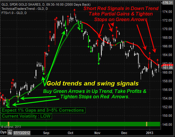
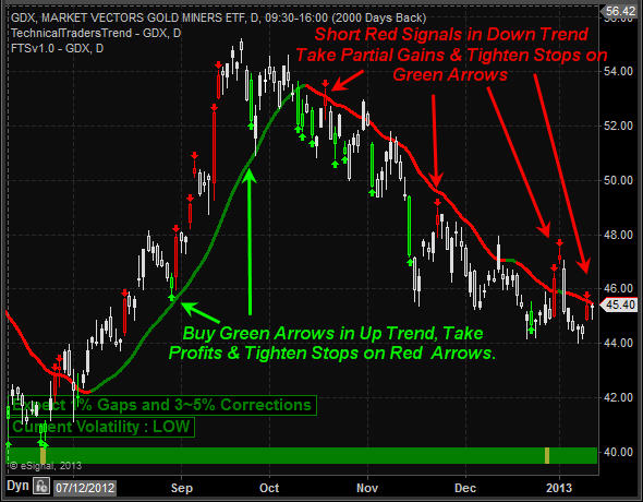
Gold and gold miner stocks have underperformed in 2012 disappointing most traders. That being said it has traded in a large sideways range since September 2011 and remains stuck in this range as of this week. Investments trading sideways are not my preferred investment of choice because some commodities and stocks for that matter can trade sideways for years before making another bull market rally.

That being said in the last six months gold has started to show life that a new bull market may be starting. 2013 is starting to look as though gold, silver and precious metals miners could lead the market higher if they can break out of their basing patterns. Until we get more bullish price action I am not planning to get long.

Take a look at the gold ETF and Gold Miner charts:

These daily charts show the trend (up/down) along with short term extreme overbought/oversold trading days. The key to long term success is to trade with the trend 90% of the time. Only years of experience will you know when it’s ok to break the rules and even then the odds are stacked against you.

Gold Weekly Chart:


Gold Daily Chart:


Gold Miners Daily Chart:
 

SP500 Stock Market Analysis:

The last five years I have been fine tuning my SP500 index trading with the use of cycles, sentiment, volume, momentum and the volatility index. Until just recently some of the data I use for generating these extreme overbought/oversold conditions were only available after the market closed. This made the high volatile trading sessions difficult to truly know if an extreme level was reached during the trading session. The exciting news is that a new data feed and a top notch programmer is allowing me to turning this once manual calculation of 17 data points taking me an average of 25 minutes to figure out into a system that generates signals in real time complete with profit taking signals, tend direction and a protective stop which self-adjusts depending on the market volatility and cycle stages.

Two other benefits are that during extremely high volatility levels and mixed cycles the system does not generate any signals. This allows us to avoid the large daily swings in price that typically shake even the most seasoned traders out of the market for repeated losing trades. Also during potential trend changes when cycles and volatility become choppy trading signals are not generated helping to avoid the volatility that takes place during reversals points when the bulls and bears are pushing each other around.

Below is a very basic version of the trend and signals for the SP500 index as it does not show profit taking, trend reversal stops or protective stops for individual swing trades yet, but it’s coming soon.


Crude Oil Weekly Chart:

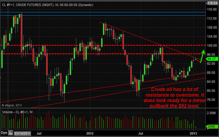
Crude oil has been making a move higher in the past four weeks but it’s now testing resistance and the chart shows a high volume doji candle. This is pointing to a pause or pullback in price should take place.
 

Natural Gas Weekly Chart:

Natural gas futures have been under pressure the past couple months but it may have put in a bottom last week. The daily and 60 minute charts show strong buyers stepping in here.


Weekend Trading Conclusion:

In short, gold and silver remain in a sideways/down trend on the daily chart. The weekly long term outlook is very bullish and once I start to see real buyers enter the market in terms of volume and price patterns I will start to accumulate a long position.

The stock market overall remains in an uptrend. We are waiting for a pause ro pullback before getting long the index. But that being said there are other sectors and commodities starting to look ripe for big moves. They are not there yet but getting closer each day.

Keep in mind that stocks, commodities and trading in general go in waves. There are times when you are busy with trades popping up left right and center and there are times when setups just do not happen. On my free stock charts watch list in November and December I posted 16 stocks and ETF setups and only one stock went south which happened to be a short trade (count trend trade). You can view my watch list here for more info: https://stockcharts.com/public/1992897

Crude oil is giving mixed signals and I am avoiding it until the daily chart gives us a bullish setup.

Natural gas weekly chart looks bullish but the current price is now trading at resistance. It must break this level before a full reversal can be confirmed.


Posted in Markets, Technical Analysis.


Copyright © 2009-2013 SurlyTrader DISCLAIMER The commentary on this blog is not meant to be taken as an investment advice. The author is not a registered investment adviser. There is no substitute for your own due diligence. Please be aware that investing is inherently a risky business and if you chose to follow any of the advice on this site, then you are accepting the risks associated with that investment. The Author may have also taken positions in the stocks or investments that are being discussed and the author may change his position at any time without warning.

Yellow Pages for USA and Canada SurlyTrader - Blogged

ypblogs.com