Pretty good returns for 2010, let’s see how 2011 shapes up:


Posted in Markets.
By SurlyTrader
– December 31, 2010
Where do the highest taxed families reside? Thanks to Yahoo! Finance we now know. The most comical name is number 1 on the list – Washington DC with 8.4% of its population making over $200k. That’s right, our public servants who are supposedly representing the majority of the working class are raking in the most money. If you do not believe the numbers below, check out the net worth of our top lawmakers.

Posted in Economics, Politics.
Tagged with politicians, rich lawmakers, rich politicians, taxes.
By SurlyTrader
– December 30, 2010
We generally think of the precious metals as Gold, Silver, Platinum and Palladium. They are all metals that could be used in art, jewelry or coinage. The interesting aspect is that Gold grabs all of the headlines. For many historic and practical reasons, Gold is thought of as the ultimate store of value and that is why it held up better in the midst of the financial crisis over its precious metal cousins:

In 2008 the precious metals plummeted with equity markets while Gold held up better
It might take a few seconds for the above chart to make sense, but each line represents the ratio of a metal’s price versus that of Gold’s. As you can see, all of these ratios sold off in 2008 as the prices of those metals fell faster than that of gold. In the last few months we have seen silver and palladium’s price catch up to their normal ratios, while copper and specifically platinum have lagged far behind. I was much more bullish on Silver a few months ago, but now it seems that if you want to make a play on metals, Platinum looks like the most attractive of the bunch.
Posted in Markets.
Tagged with copper, gold ratio, inflation, palladium, platinum, precious metals, silver/gold ratio.
By SurlyTrader
– December 29, 2010
Gold is surging above $1,400 per ounce so it seems like a good time to evaluate Gold’s run along with its relative value versus other precious metals. The first item to note is that Gold did not become an exciting investment until Nixon put the kibosh on the Dollar’s peg to Gold on August 15th, 1971. What this means is that inflation adjusted gold prices did not vary much in dollar terms until about 1970. We can see that directly in an inflation adjusted price chart. It is interesting to note that even though gold increased in value by well over 600% between 1969 and 1980, it was a terrible investment after that period until about 2001.

Two historic spikes in gold prices
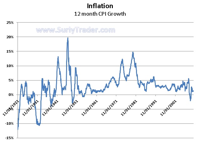
The most impressive run-up peaked at the beginning of 1980. As you would expect, inflation was at or near its peak when gold was spiking. The same approximate time period would mark the peak in longer term treasury rates as well, though they lagged by about 6-9 months.

Gold spikes when inflation spikes? Not really.
The above inflation chart is interesting in combination with the spike in gold because we are currently seeing gold rally ferociously without any sign of inflation. Our entire premise for a rally in gold is based upon our expectation of currency devaluation or general lack of faith in our government and its ability to pay its debts in real dollars. I will not argue that point or the extent to which the dollar may devalue over time, but I will be cautious of just how violently gold can bust as it did after its 1980 peak.
Posted in Economics, Markets.
Tagged with Bretton Woods, copper, Currencies, currency devaluation, dollar, gold, inflation, palladium, platinum, precious metals, silver.
By SurlyTrader
– December 28, 2010


