Skip to content


One Picture for Relative Value

There is one graph that blatantly stands out and should make you question your own asset allocation.  The graph I refer to is the ratio of the current earnings yield on the S&P 500 (Trailing 12M earnings/S&P 500 Price) divided by the current 10 year treasury yield.  This monthly graph since 1962 has looked like this:

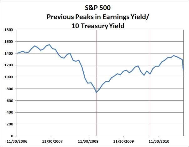
Tonight’s closing ratio of 3.86 is significantly higher than the two previous month end peaks of 3.03 on February 27th 2009 and August 31st 2010.  If you cannot remember what happened after those peaks, here is a graphical reminder:

Maybe it is time to rethink your asset allocation with respect to equities versus bonds.

Posted in Markets, Trading Ideas.

Tagged with , , , , , .


Copyright © 2009-2013 SurlyTrader DISCLAIMER The commentary on this blog is not meant to be taken as an investment advice. The author is not a registered investment adviser. There is no substitute for your own due diligence. Please be aware that investing is inherently a risky business and if you chose to follow any of the advice on this site, then you are accepting the risks associated with that investment. The Author may have also taken positions in the stocks or investments that are being discussed and the author may change his position at any time without warning.

Yellow Pages for USA and Canada SurlyTrader - Blogged

ypblogs.com